The Weather Network, 2025
Redesign of The Weather Network website for improved usability, accessibility, and overall user experience.
SCOPE
UI/UX Design
ROLE
UI/UX Designer
TOOLS USED
Figma
Adobe Illustrator
THE PROBLEM
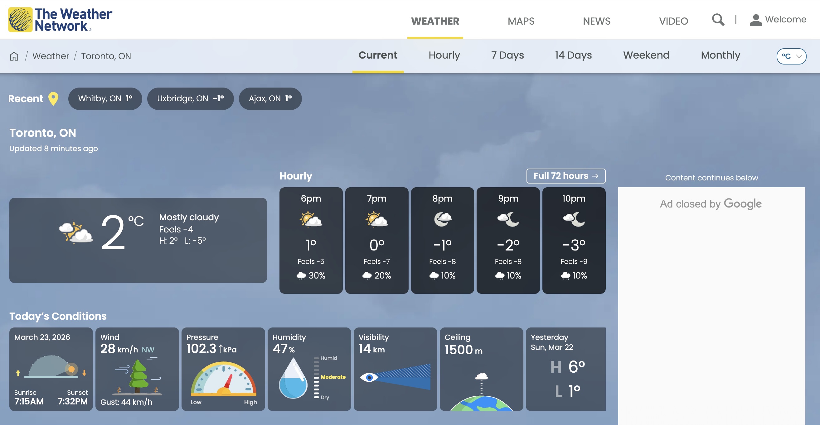
The Weather Network website has an overload of information, disorganized content, and a complex navigation system. There is also repeated and unnecessary information, and a lack of visual hierarchy. This makes it difficult for users to find what they need quickly.
THE RESEARCH
In order to solve this problem, I looked at competitors such as Acuuweather, Weatherbug, and OpenWeatherMap. Then, I identified the strengths and weaknesses, making note of opportunities for improvement to The Weather Network.
THE PROCESS
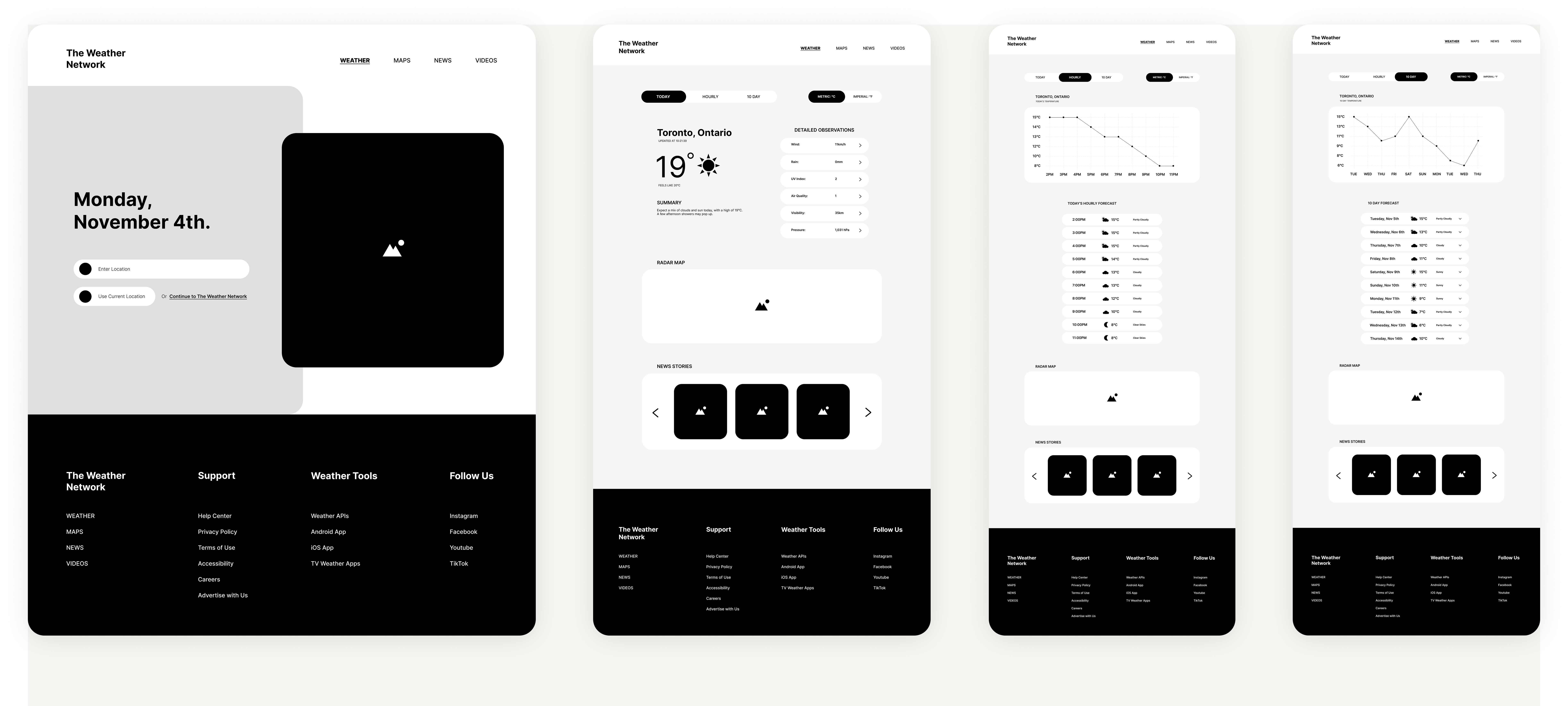
After deciding on the changes I needed to make, I created mid fidelity wireframes, along with a prototype. This helped me assess the flow of the website and discover any challenges.
THE SOLUTION
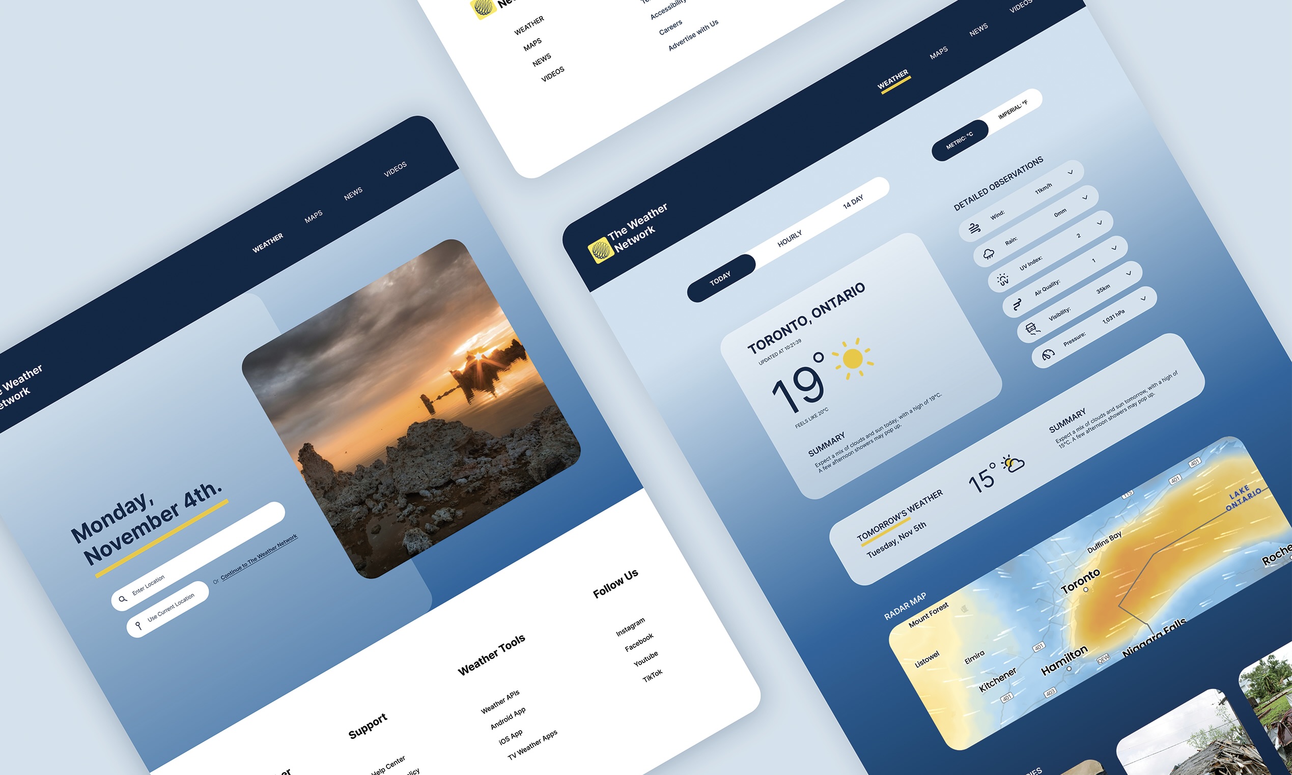
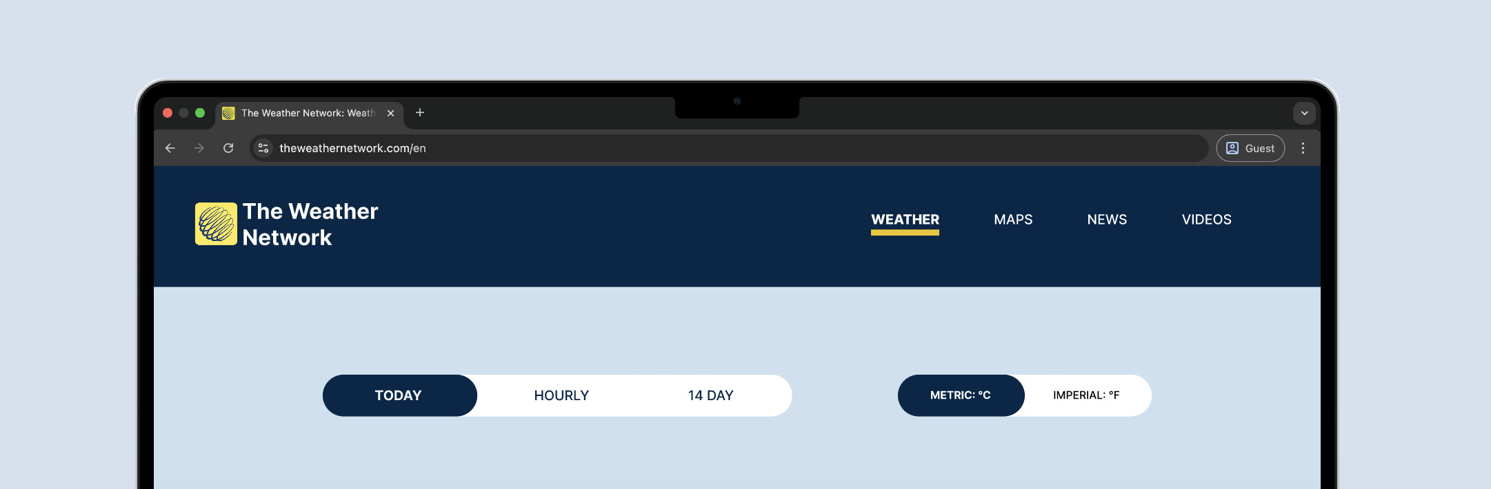
To begin the website, I refined the navigation system by establishing a clearer hierarchy and stronger distinction between primary sections and subsections.
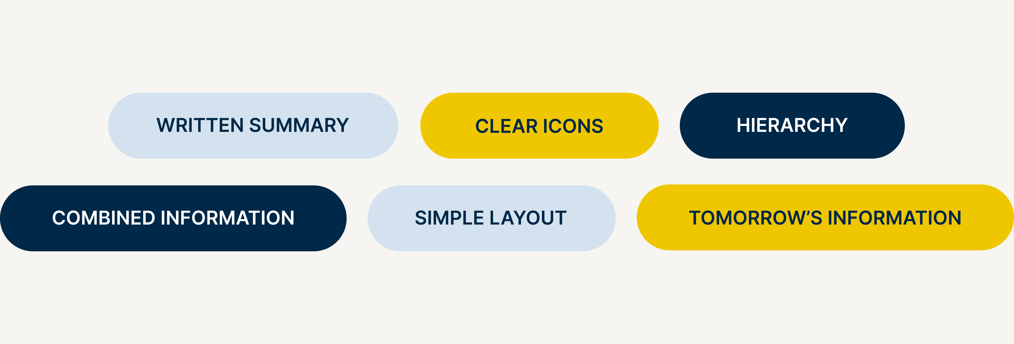
On the home page, there is a clear hierarchy of information, with the most important information standing out first. I also added a short, written summary of the current weather, and tomorrow's weather underneath.
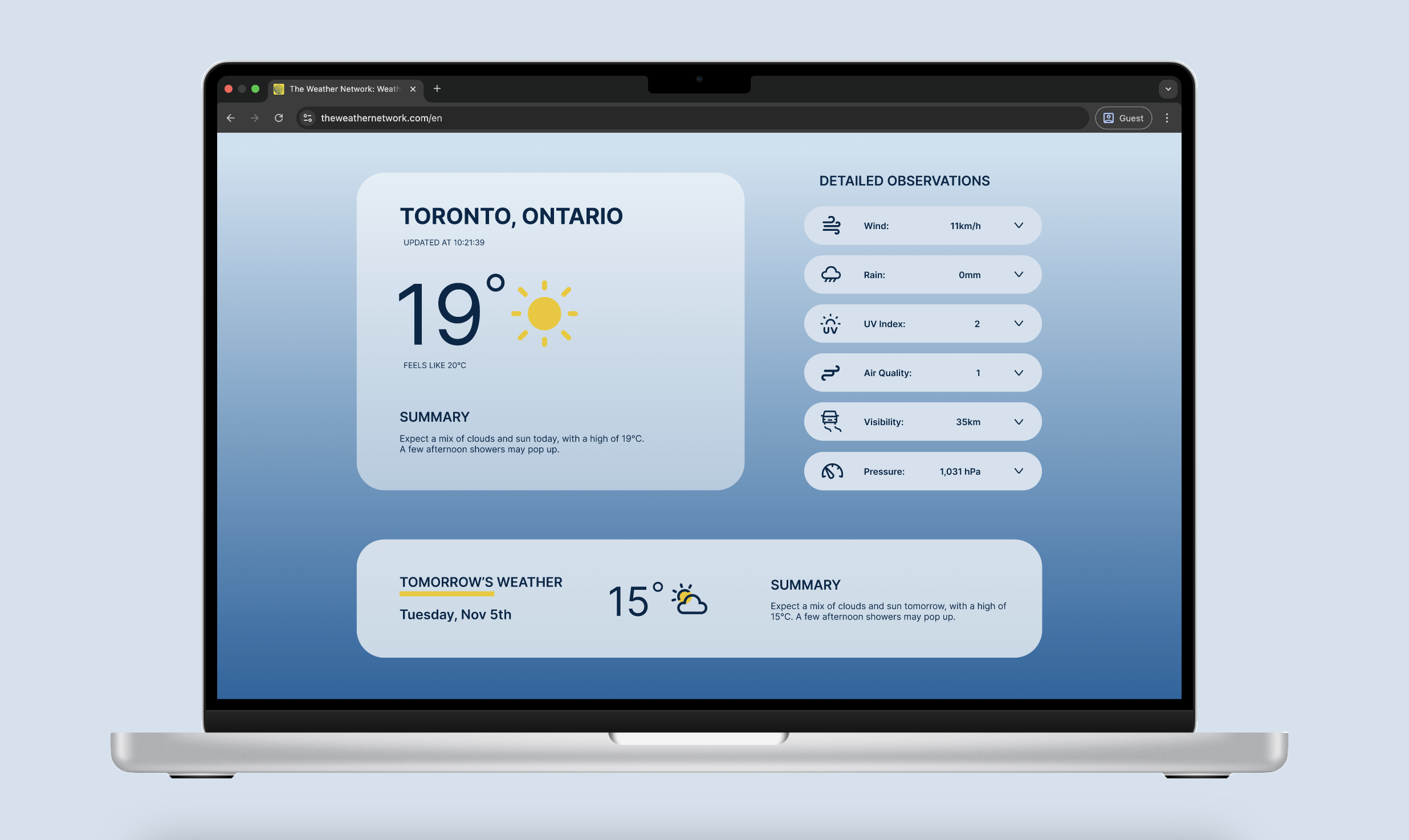
Basic information is presented upfront, with optional dropdown menus to reveal more detailed content.
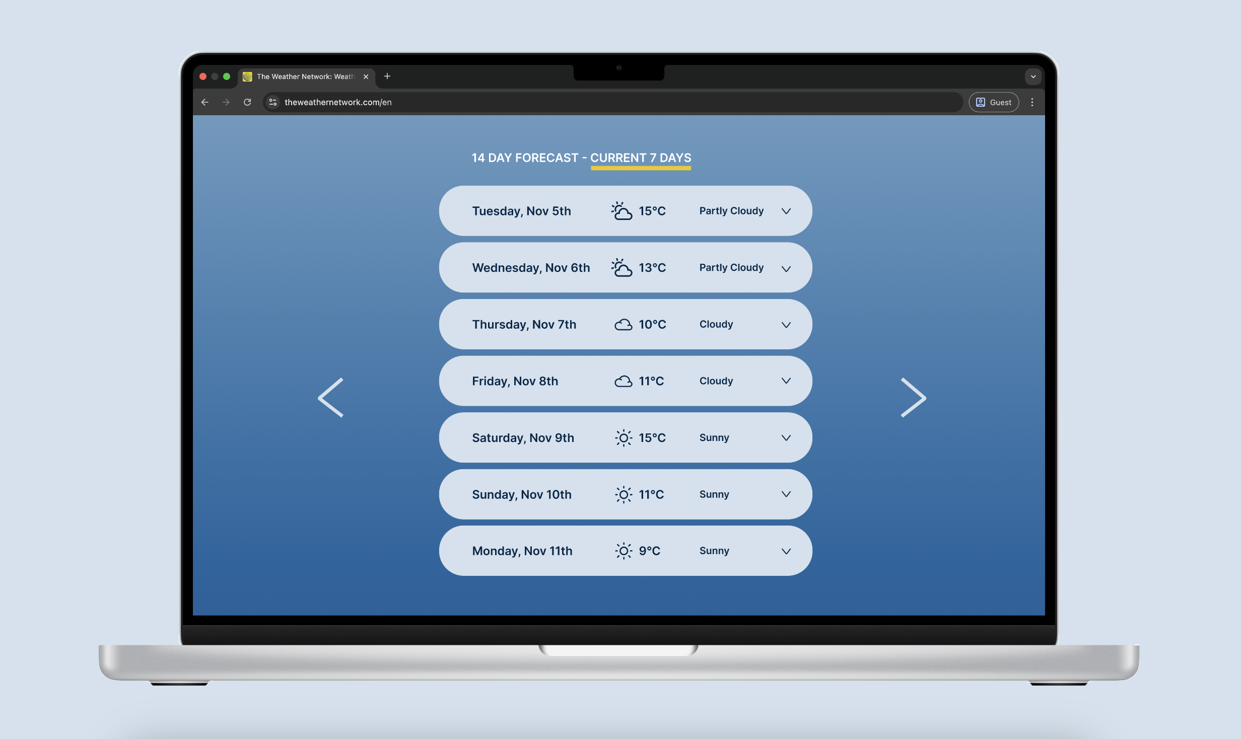
I combined the 7 and 14 day pages, with optional dropdown menus as well.
EXPLORE MORE OF MY WORK