Hockey Helps the Homeless, 2026
Redesign of the 2026-2027 tournament season printed materials for improved consistency, layouts, and overall experience.
SCOPE
Brand Refresh
Print Design
Production Design
TOOLS USED
Adobe Illustrator
Adobe InDesign
TEAM & ROLES
Jenna Gauthier, Lead Designer
Rania Houache, Creative Director
OBJECTIVE
Throughout the 2025–2026 tournament season, I worked with the existing print templates and identified opportunities to improve the overall visual system. Challenges included limited layout flexibility, maintaining readability with large amounts of information, and creating scalable assets for future use. As the organization continued to evolve, the materials also required a refresh to create an enhanced experience for players.
THE RESEARCH
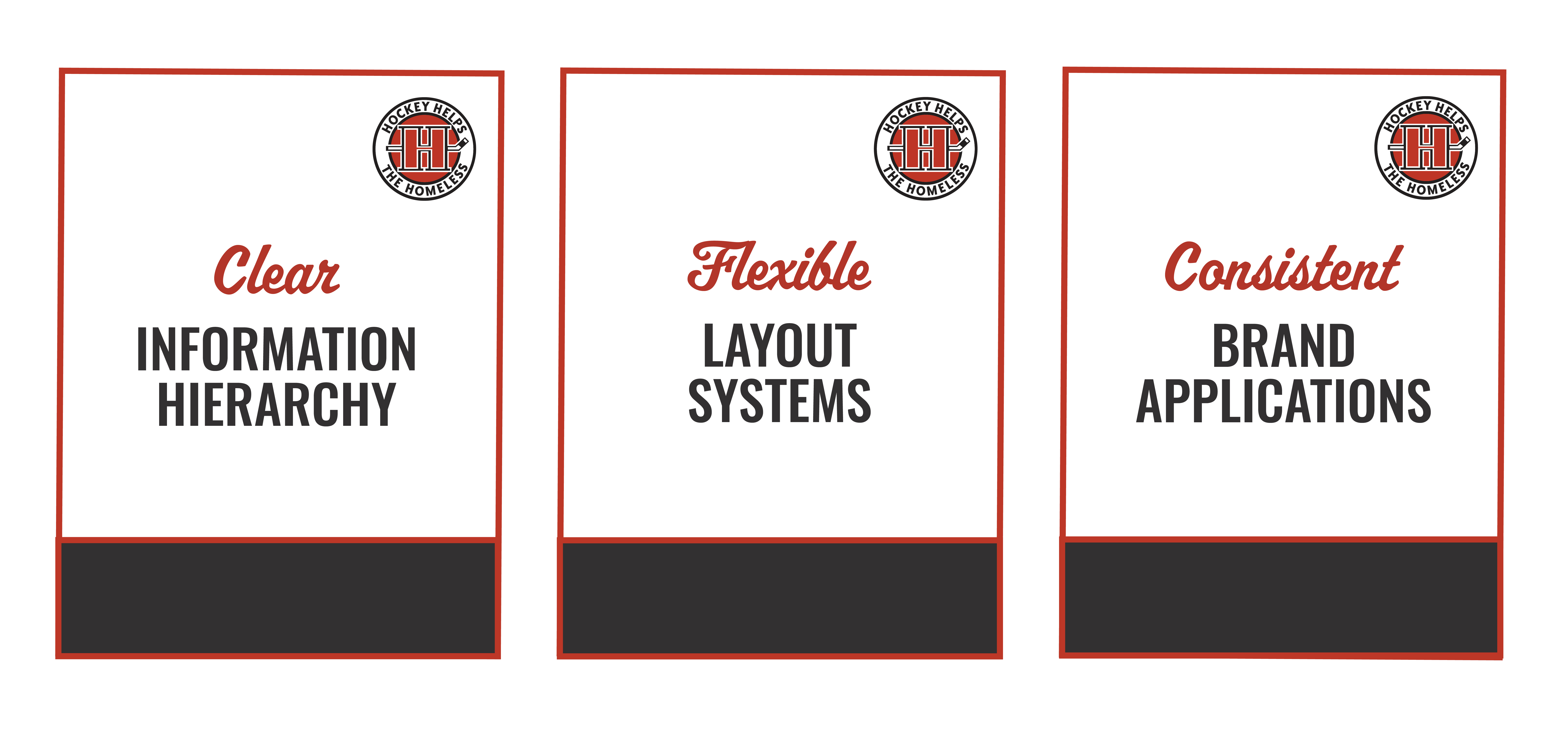
The research for this project focused on organizing these challenges into 3 key areas, in order to define clear design opportunities. I also reviewed the brand guidelines to better understand the existing visual system, identify elements that needed to remain consistent, and determine where there was flexibility to introduce improvements.
THE PROCESS
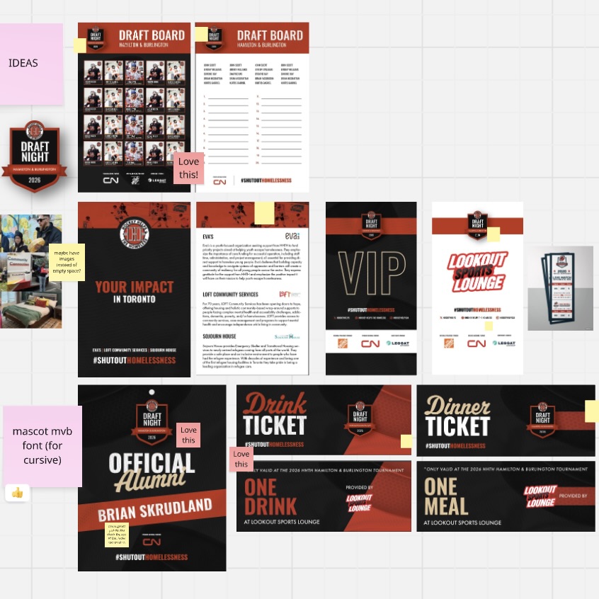
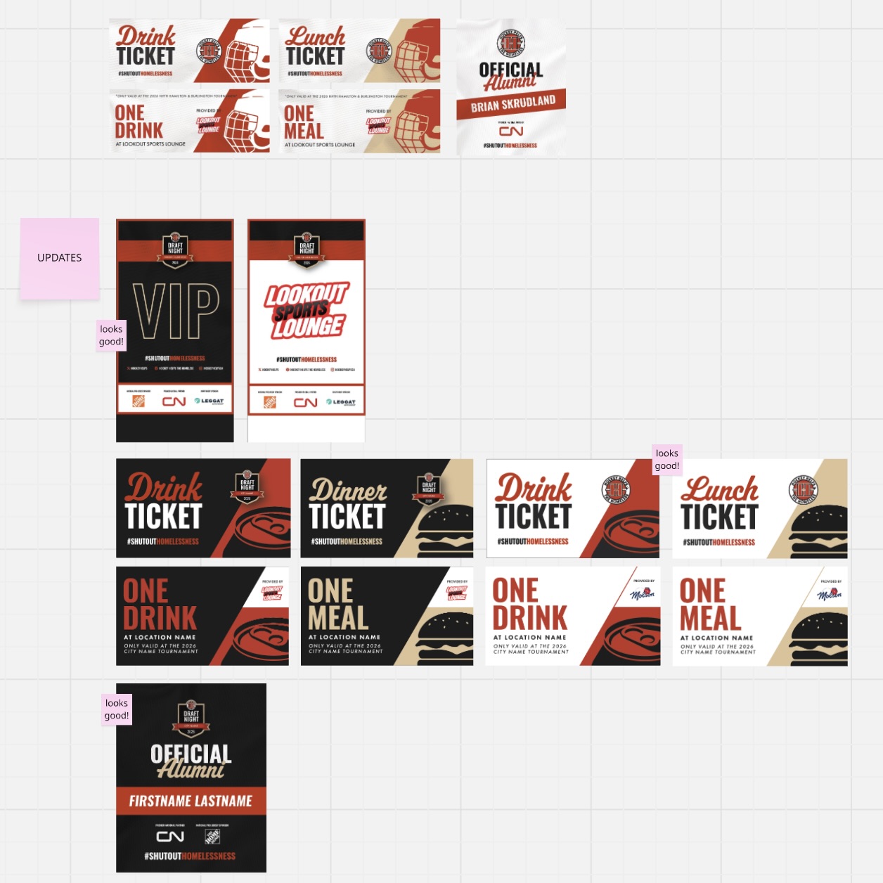
The design phase was an iterative process involving concept development, feedback, and refinement. Concepts were reviewed through Miro, where feedback and annotations helped guide revisions, followed by discussions to evaluate solutions and finalize the designs.
THE SOLUTION
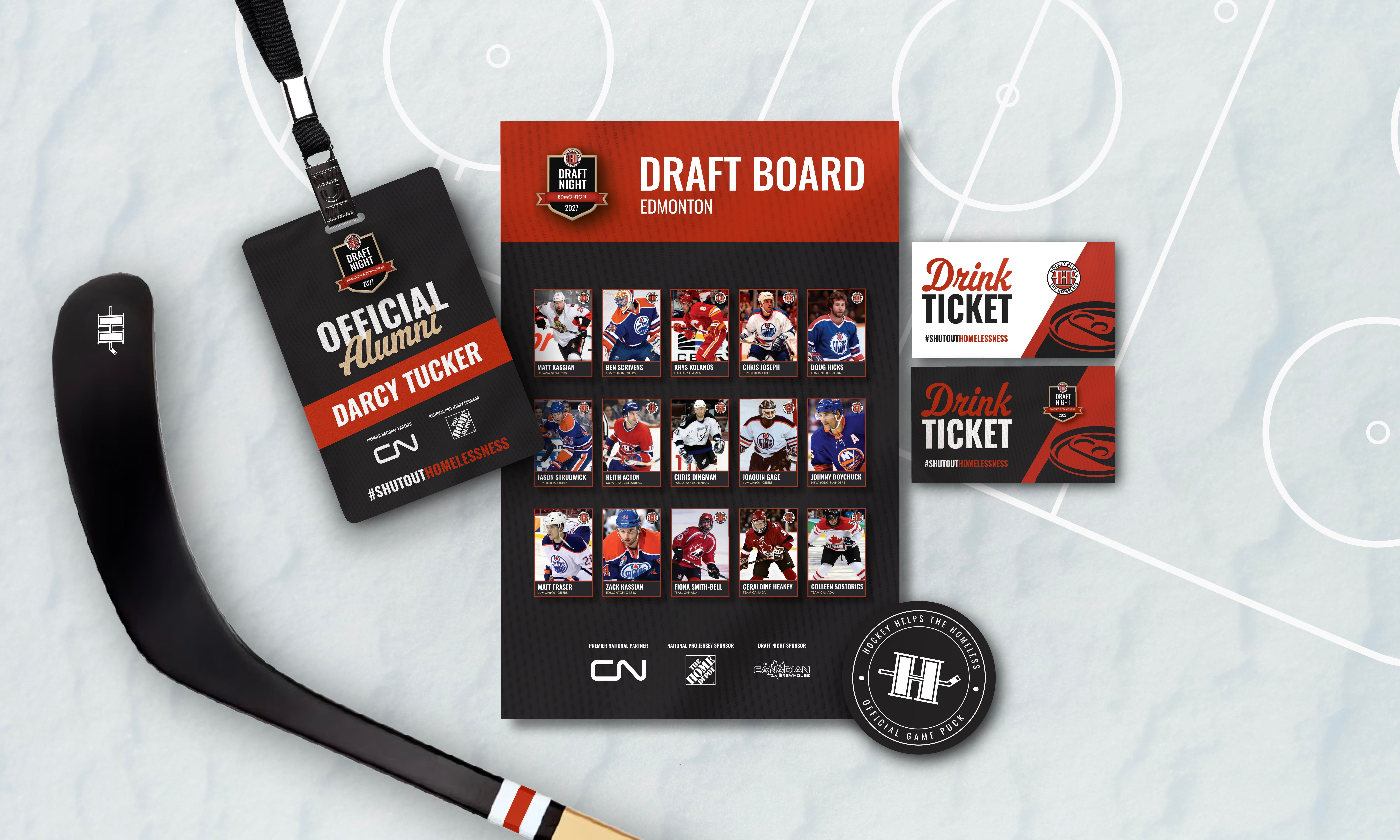
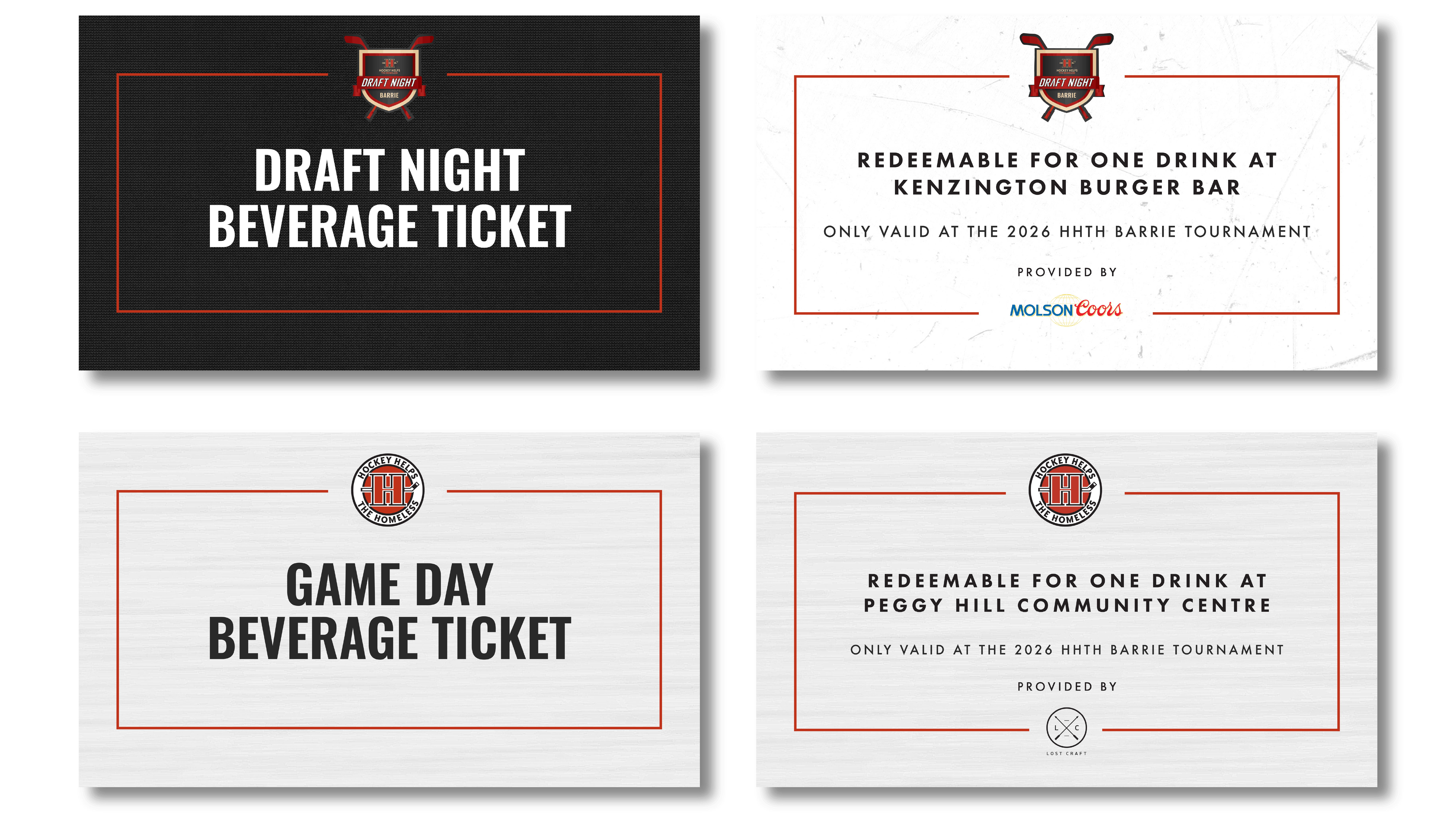
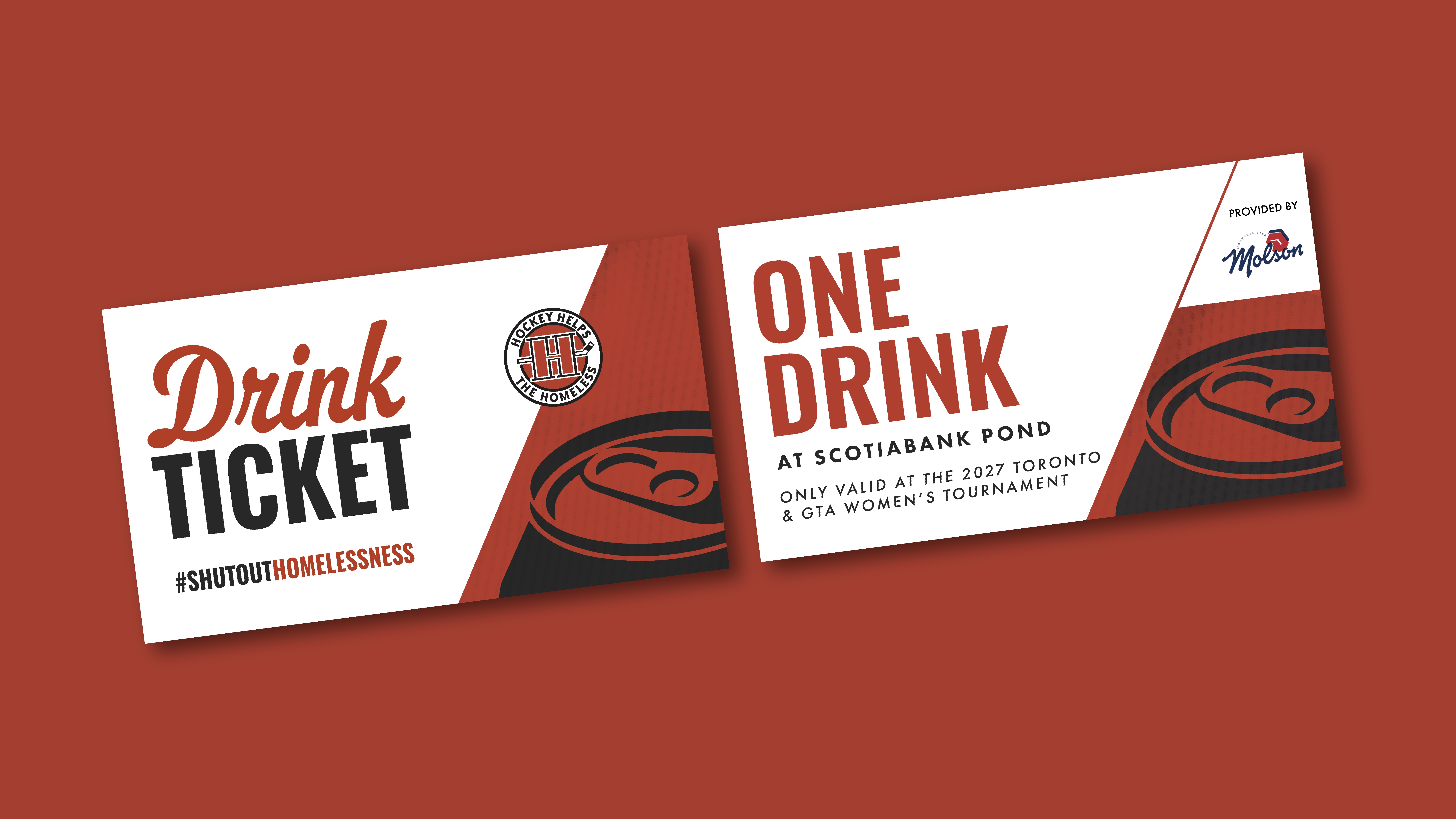
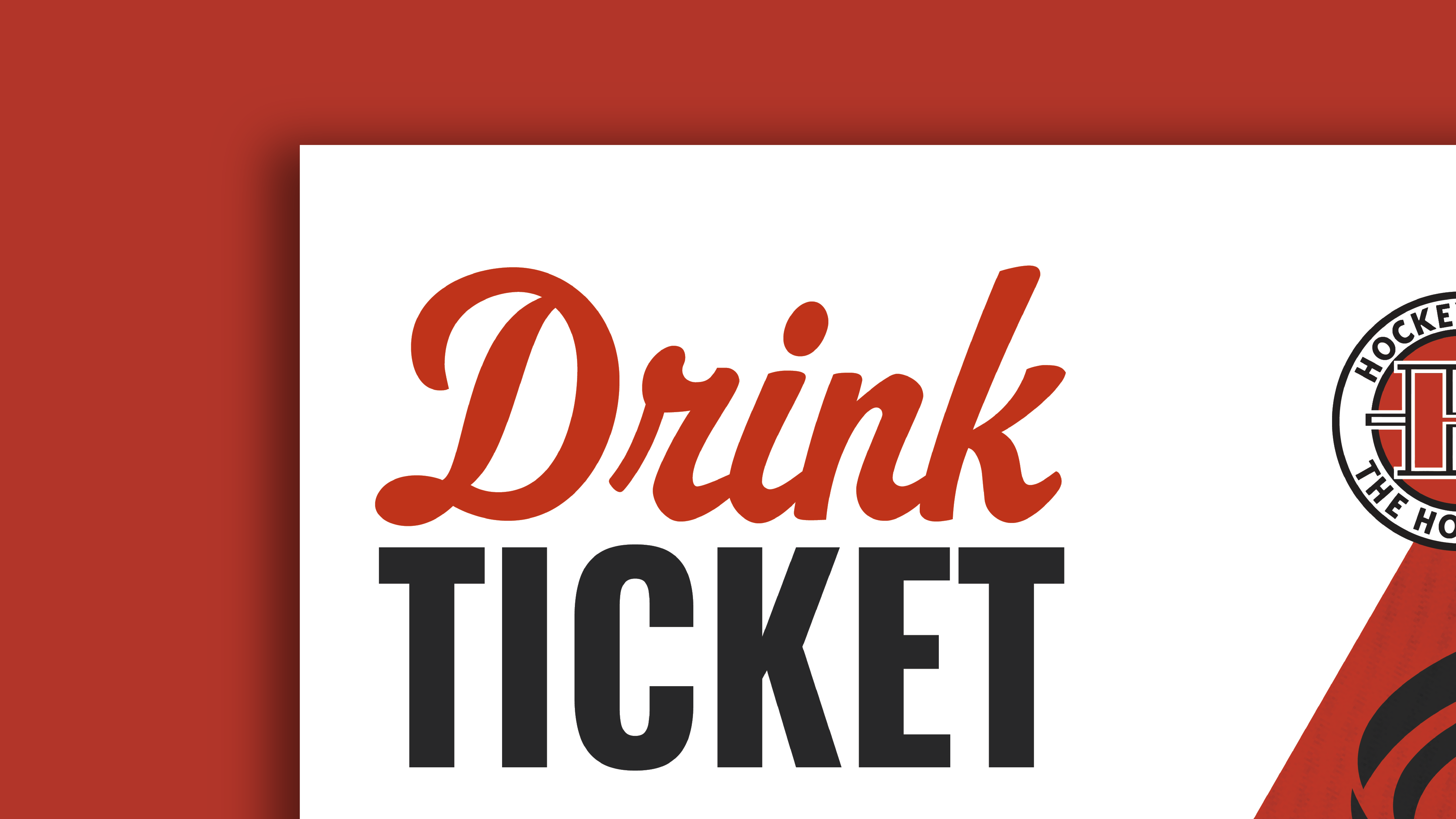
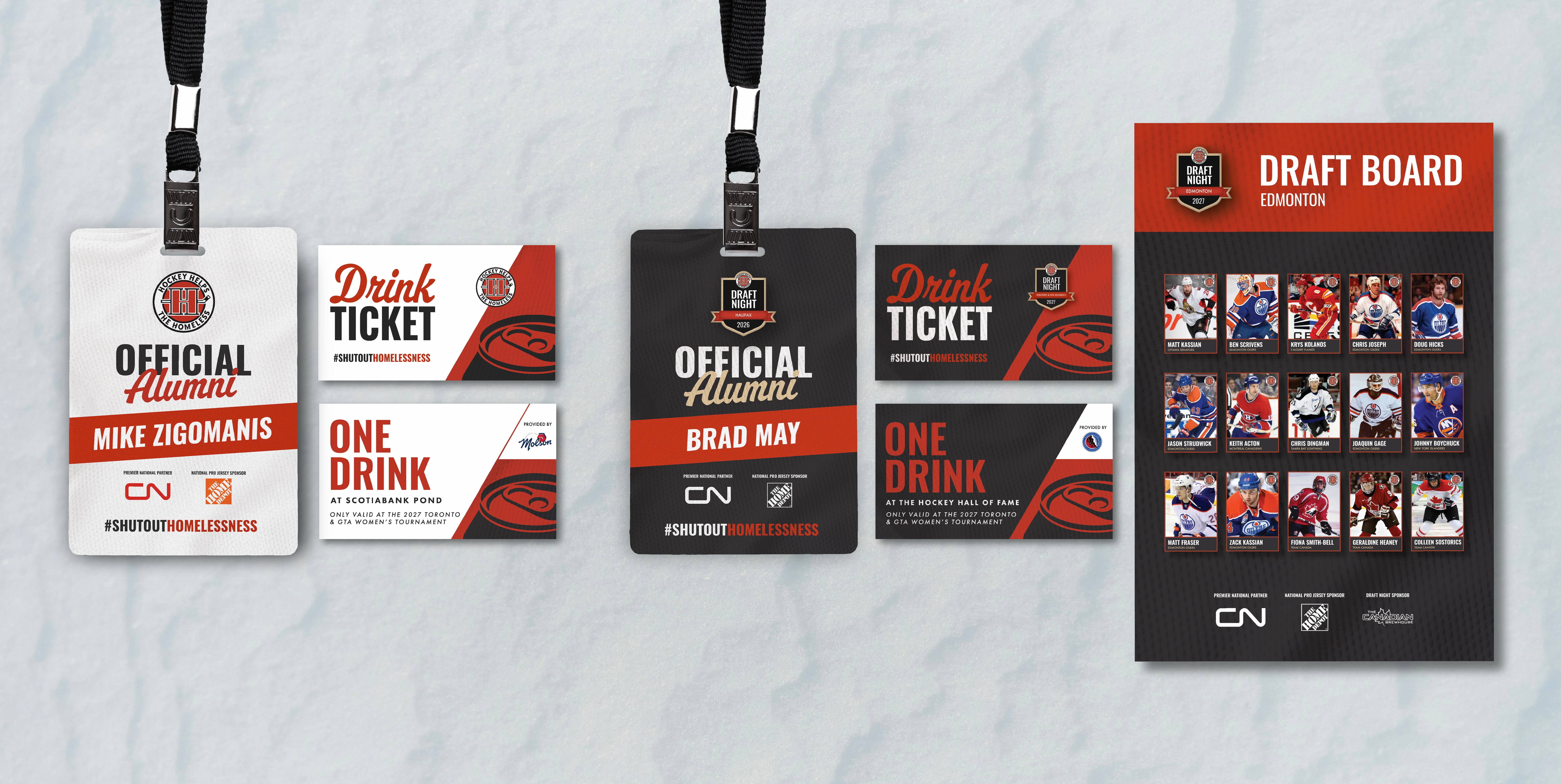
The ticket redesign focused on strengthening the information hierarchy by emphasizing the ticket type with bold typography and icons, making each ticket easier to recognize. A dark colour palette for Draft Night and a lighter palette for Game Day created a cohesive visual system while still distinguishing the two events.
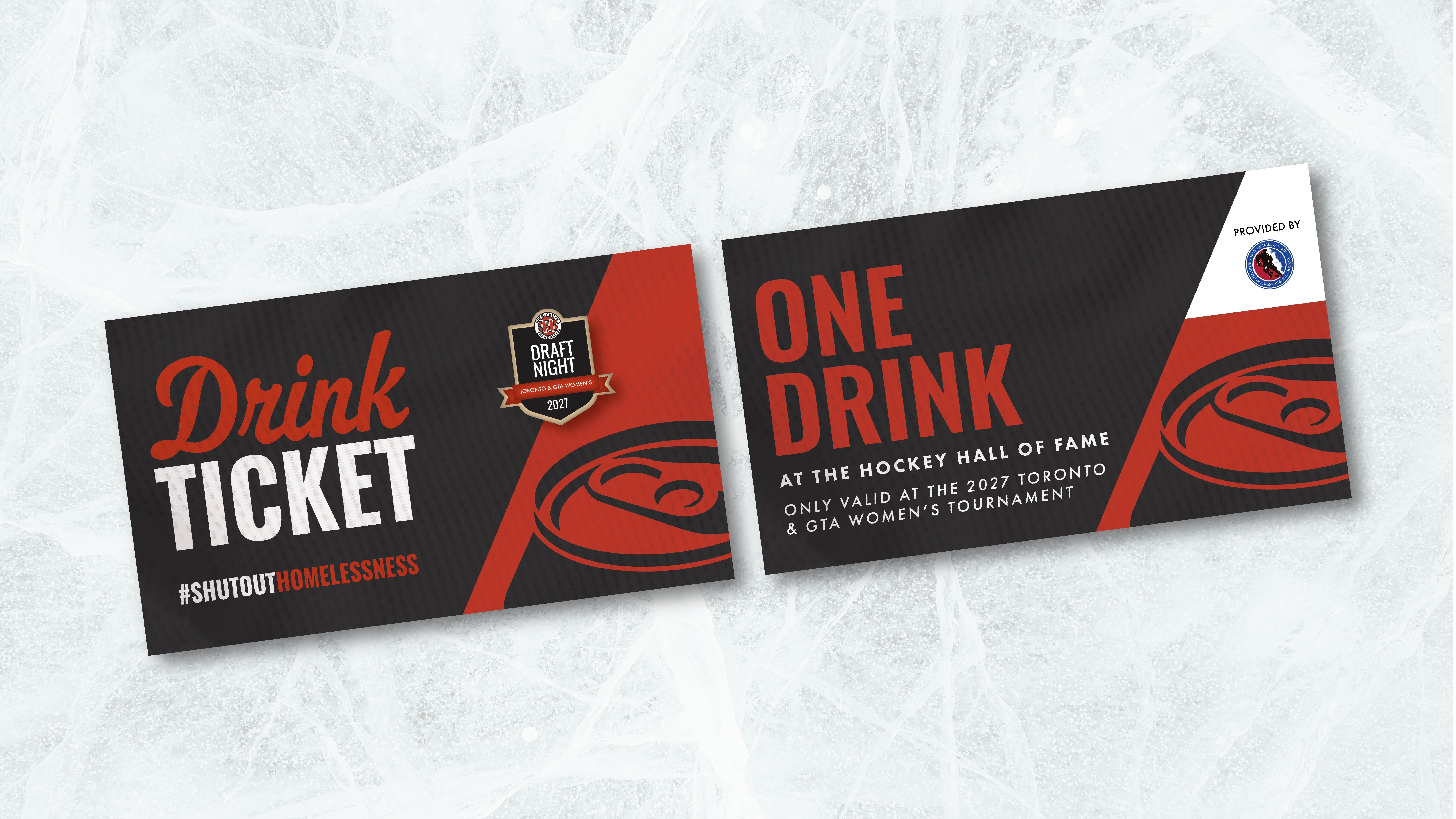
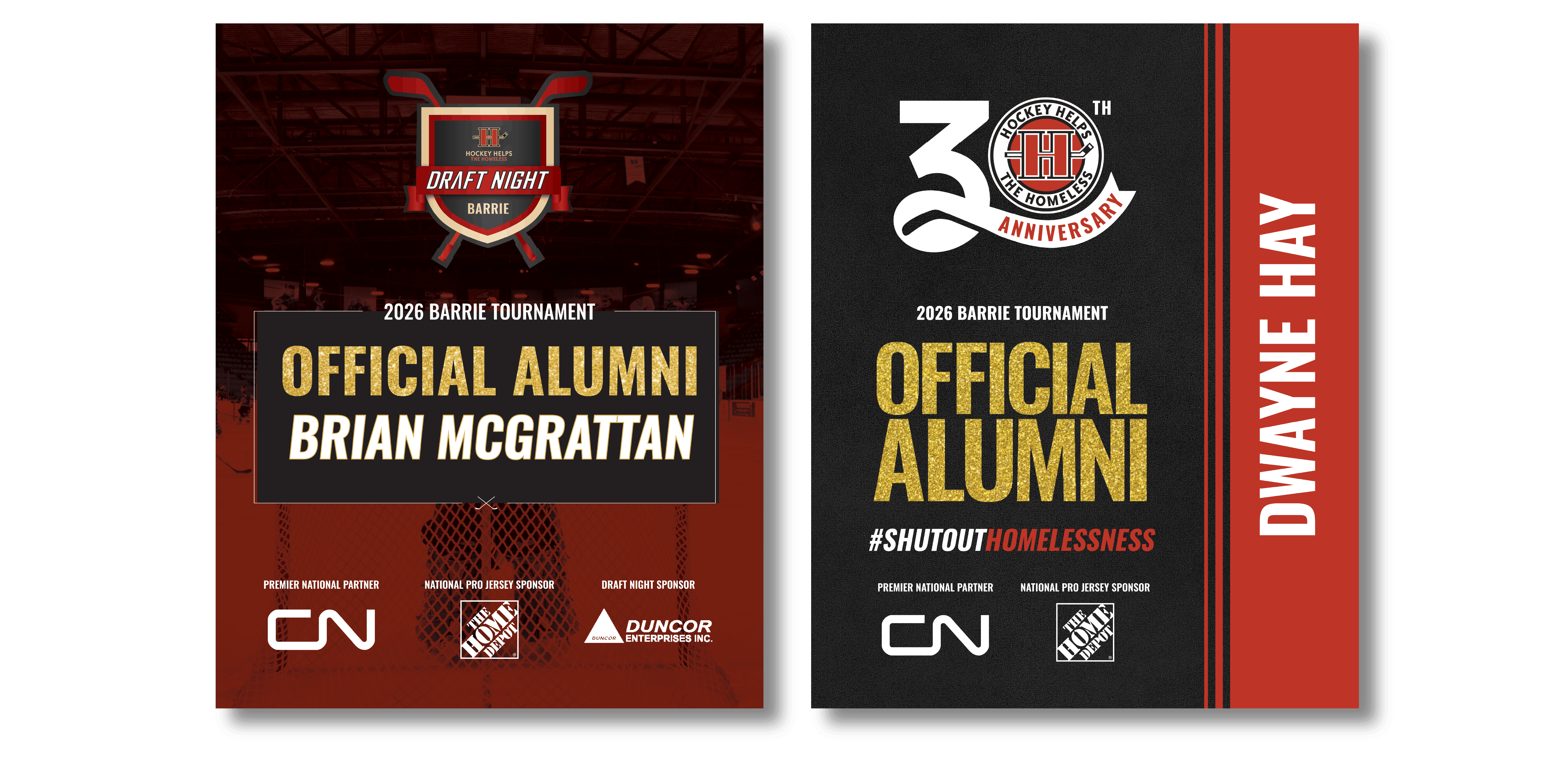
The Draft Night logo was refreshed to create a more modern appearance while aligning more closely with HHTH’s brand guidelines through consistent typography and colour usage.
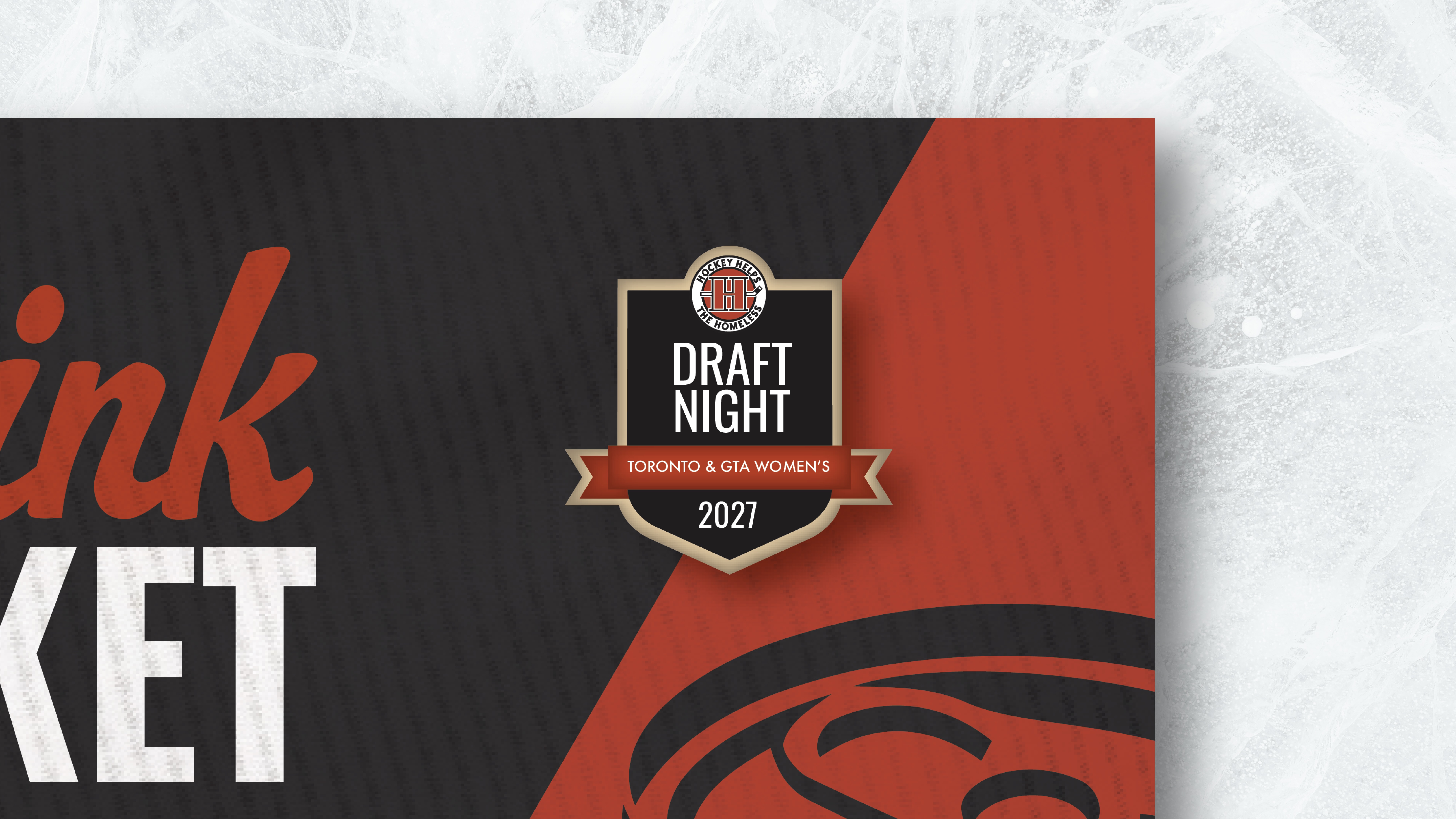
Additionally, a script typeface was introduced to bring personality and energy to the brand while creating a more welcoming and memorable event experience.
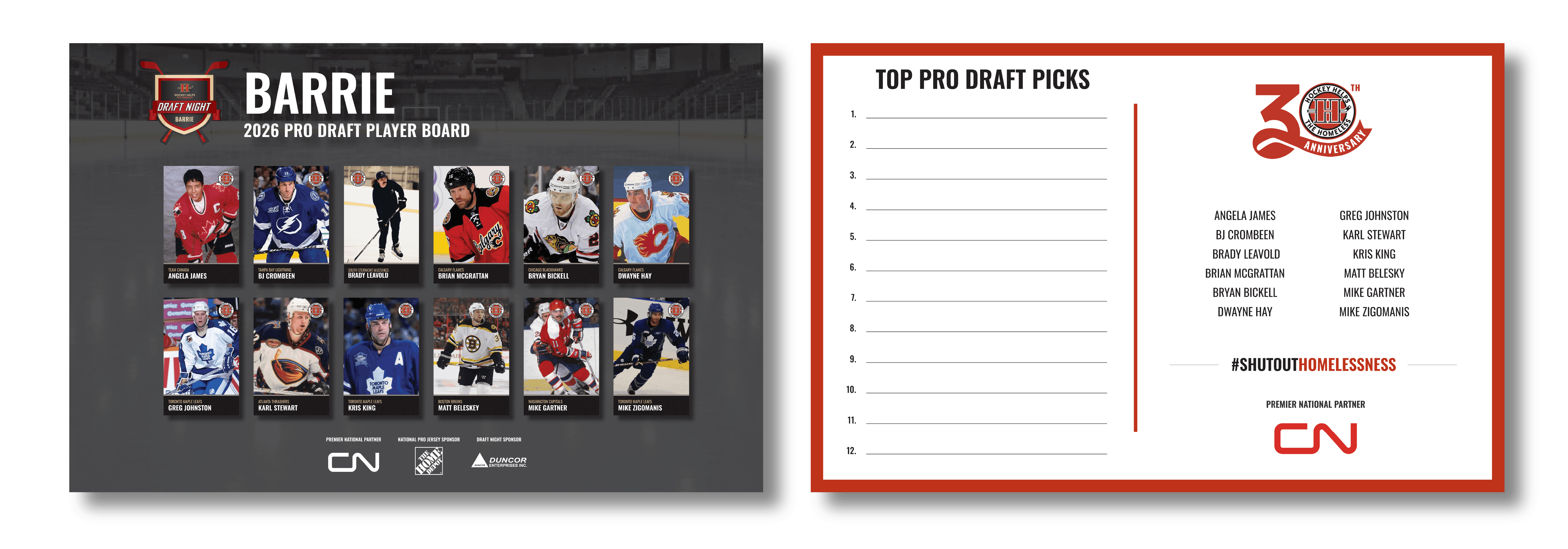
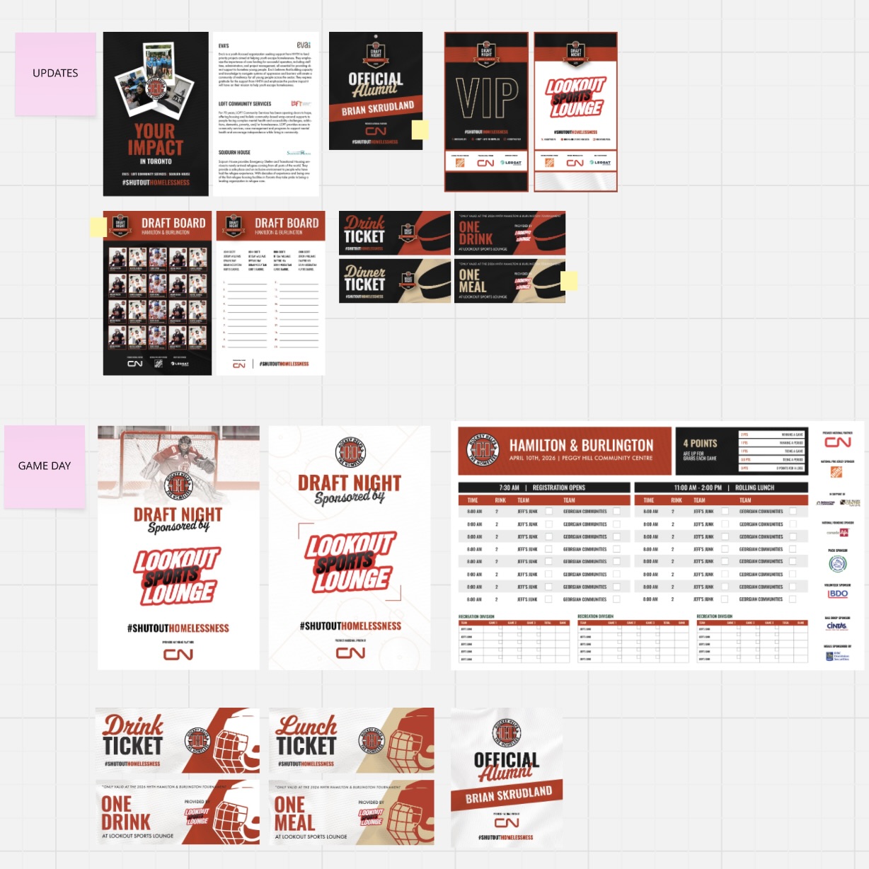
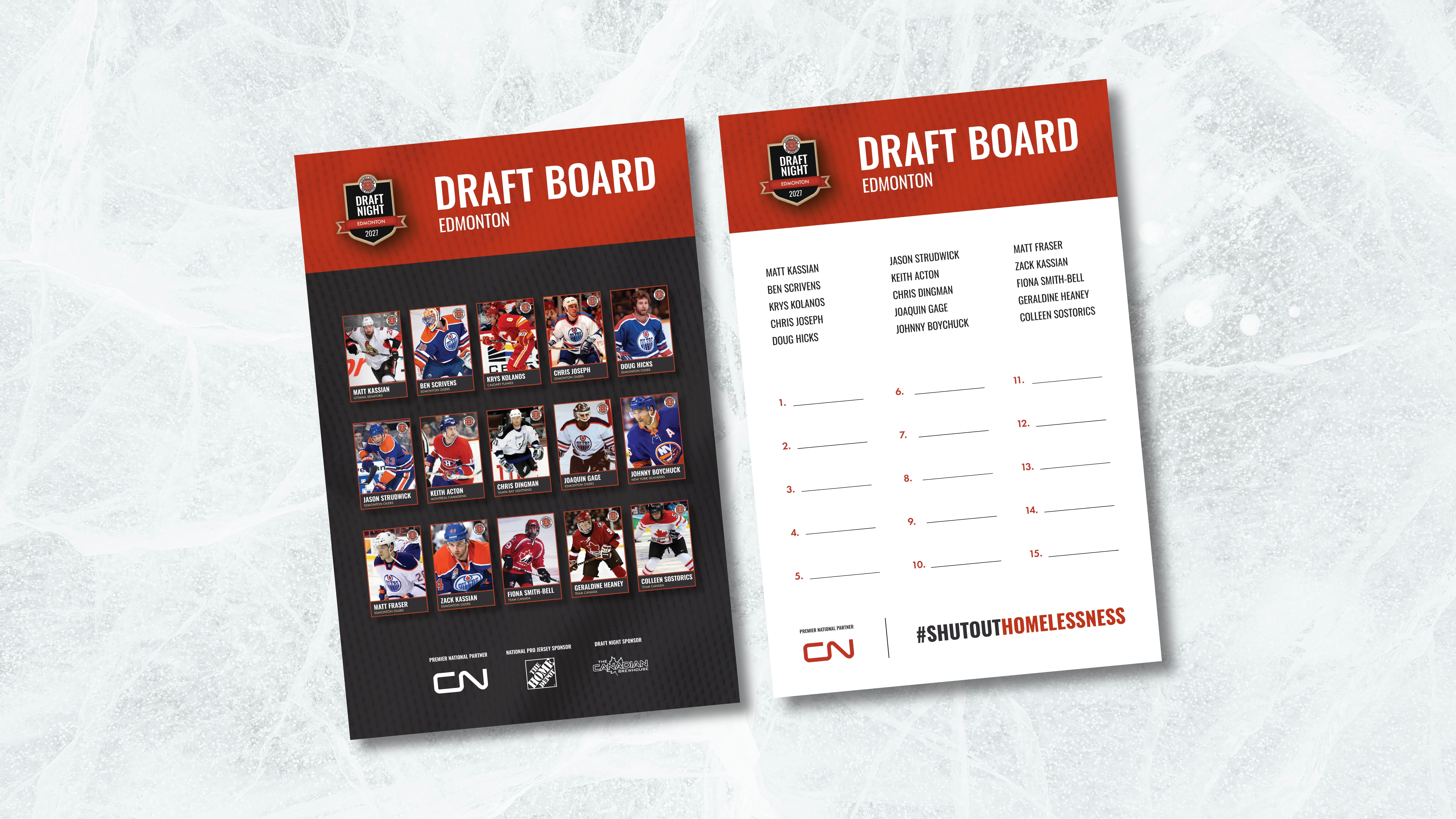
The draft board was redesigned by changing the orientation from horizontal to vertical, creating more flexibility within the layout. This allowed information to be organized more effectively, improved visual hierarchy, and provided more space to increase font sizes and overall readability.
The badges were redesigned to align with the established Draft Night and Game Day visual themes. The names were also given more emphasis through improved hierarchy, making it easier to identify quickly within the overall layout.
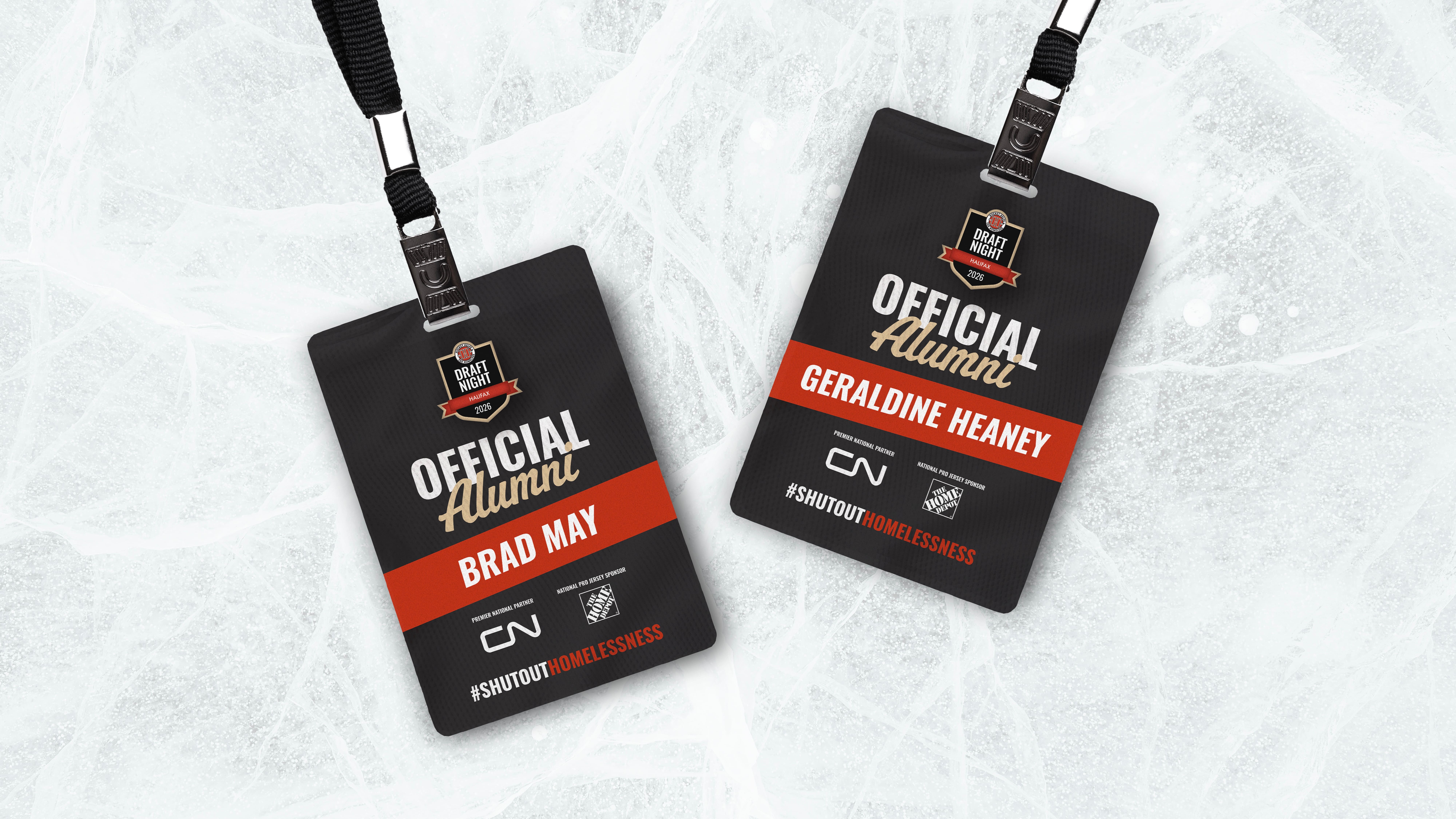
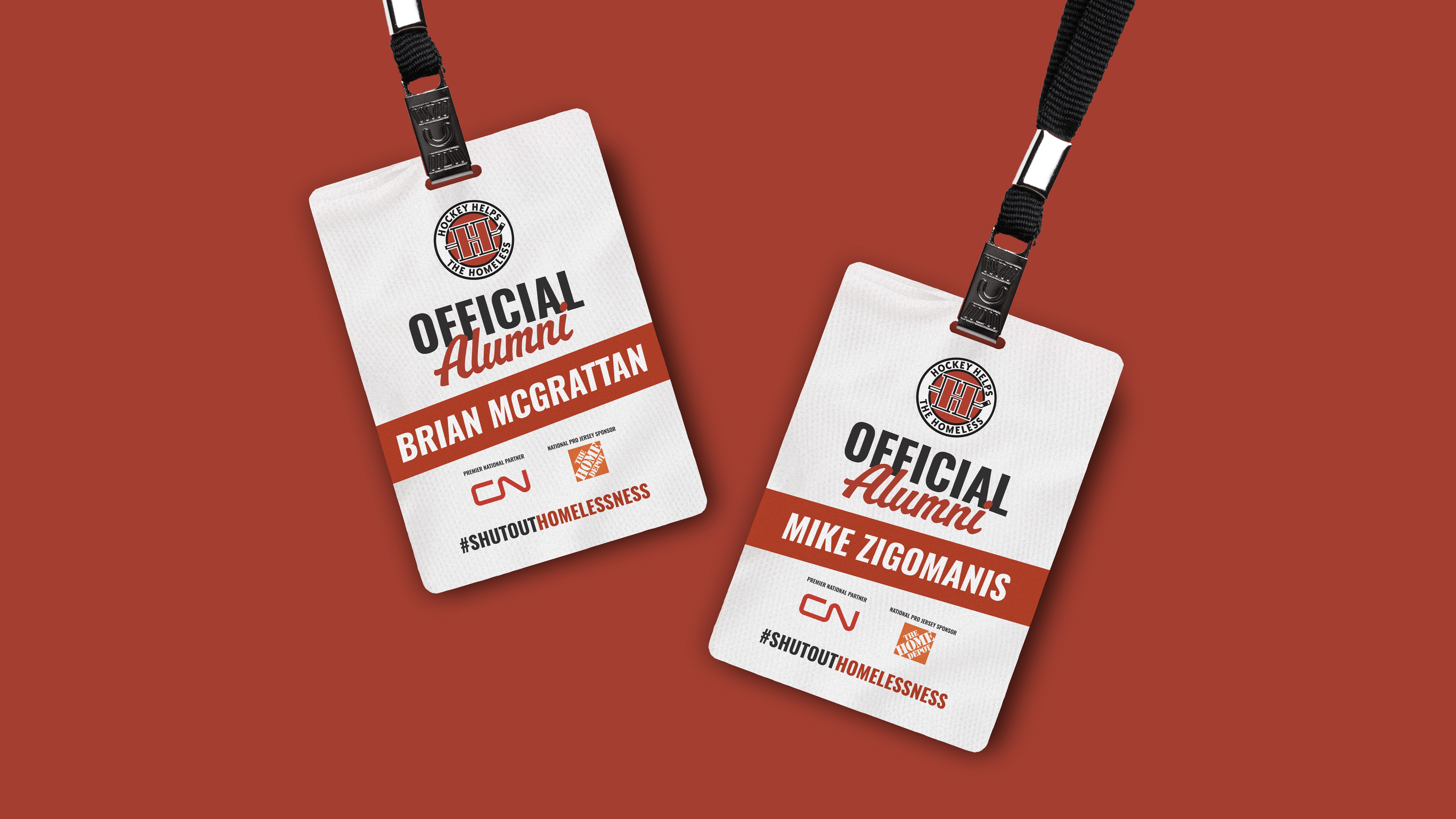
Finally, an overview of all the materials to showcase the refreshed visual system.
EXPLORE MORE OF MY WORK